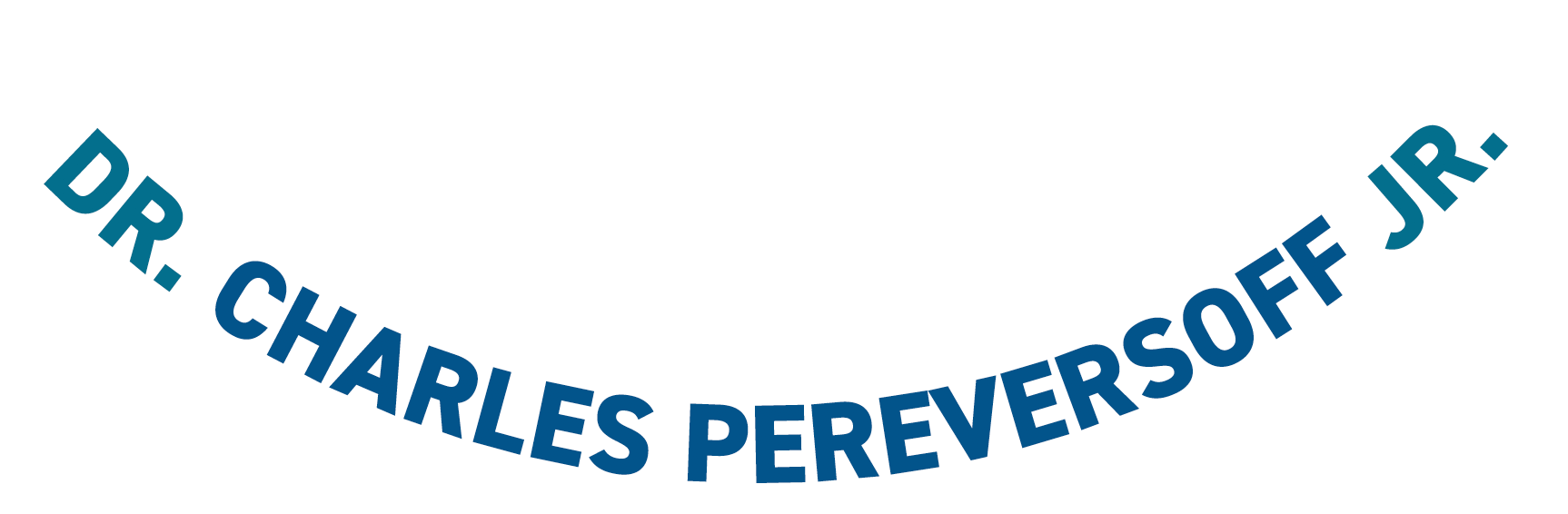
Logo
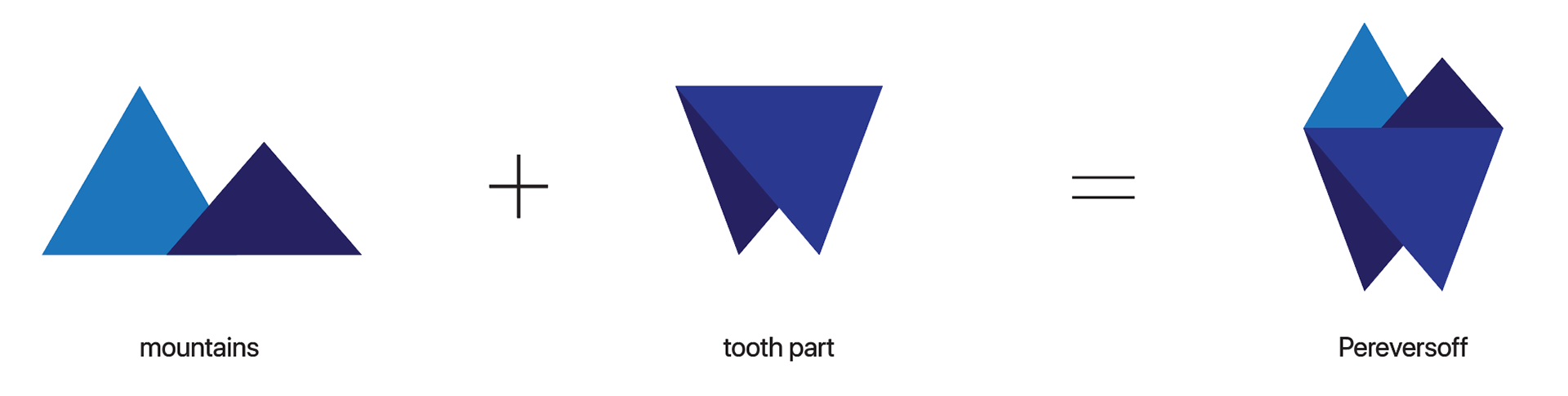
There should be a balance. The client loves outdoors and does not recommend using cliche dental imagery. The challenge here is to not create a logo that is too ‘outdoorsy’ and not too ‘dental’ but a fusion that creatively and equally carries both ideas.
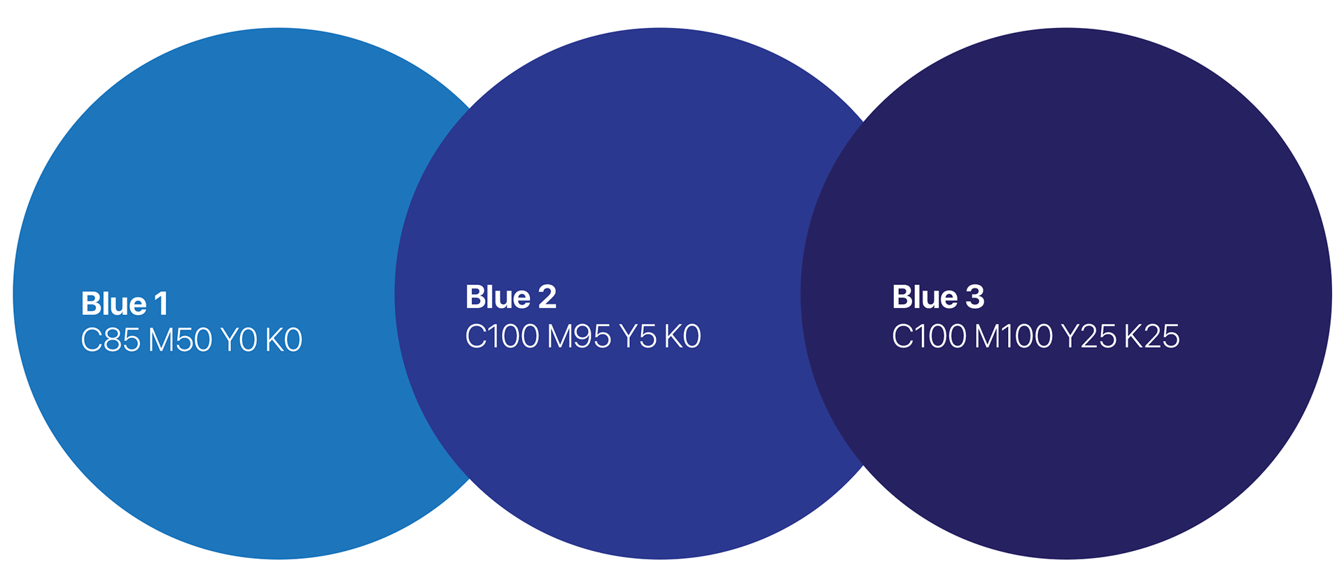
Colour Palette
All shades of blue. The client expressed his appreciation of the colour blue. I chose shades of blue that when put together, create a formal yet friendly tone.
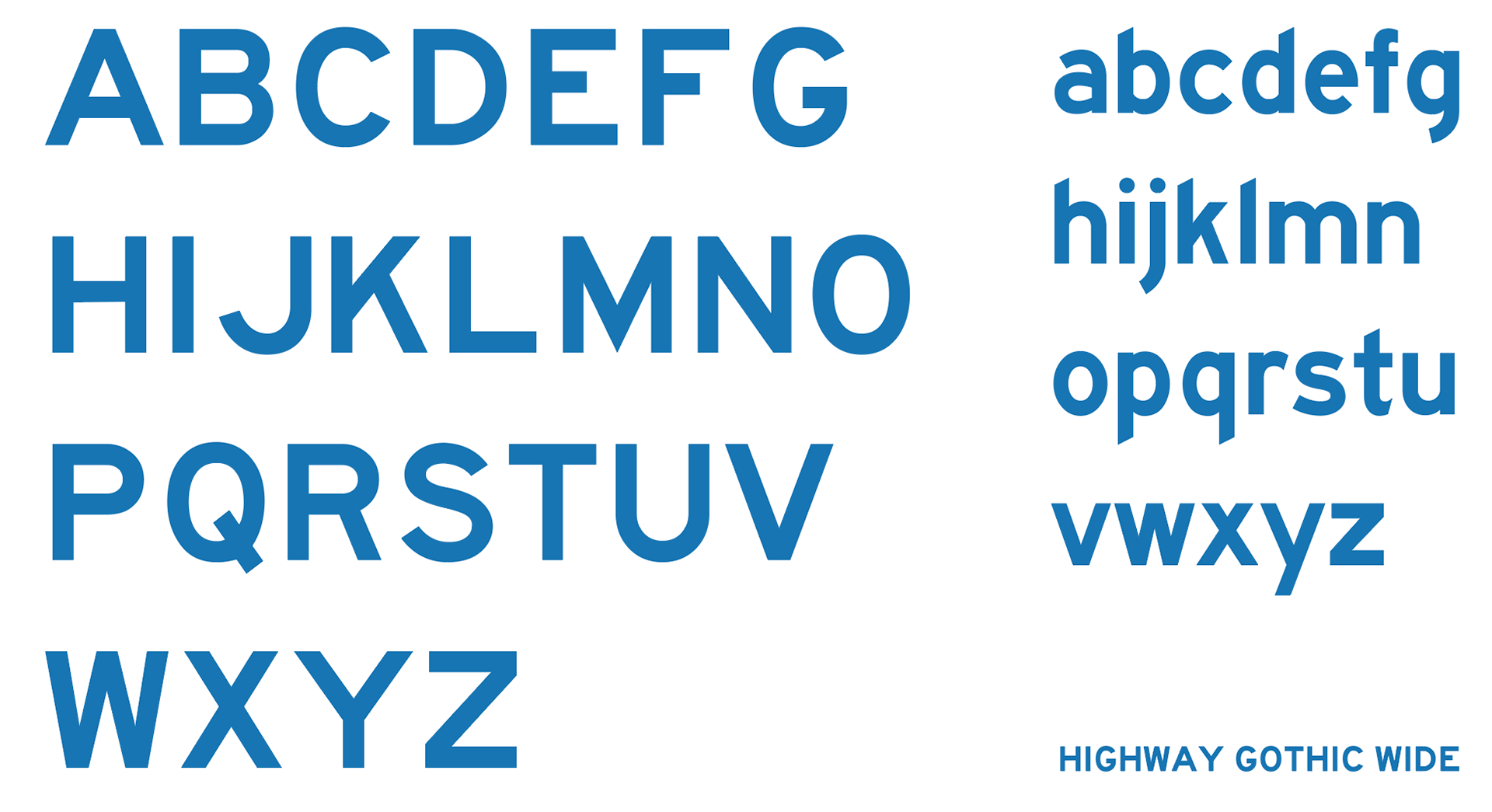
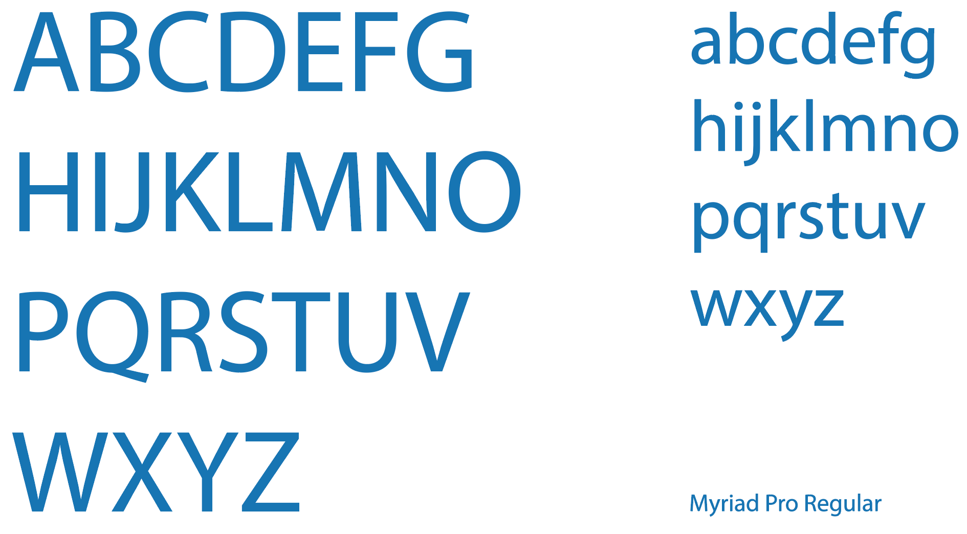
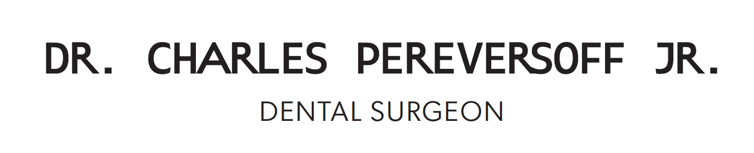
Typography
I chose Highway Gothic because during consultation, the client liked wide typefaces. This typeface has a wide font and is easy to read, especially in all caps. This is the brand’s primary typeface.
Myriad Pro Regular is a great font for body text. It is legible and it looks formal. This font maintains the professional tone of the brand and is best used on letterheads and billing statements.
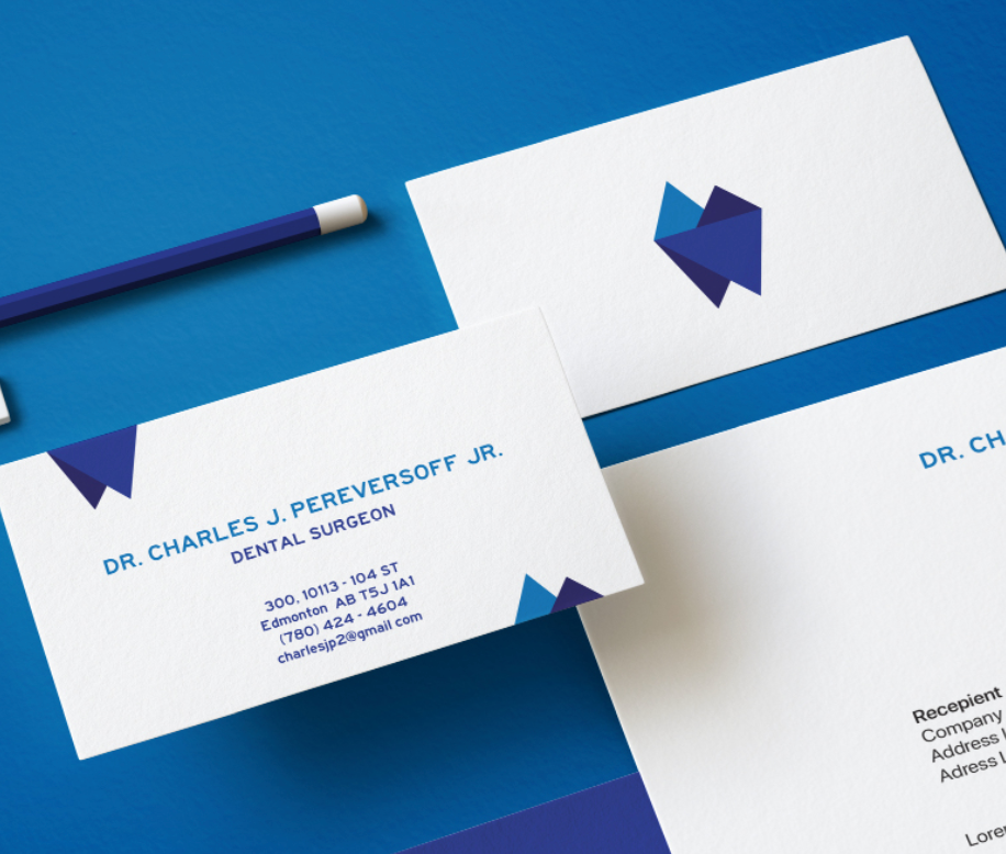
Business Card
The business card highlights the client’s passion for outdoors and work. The logo is split into two to show that. The layout provides space for the client to write short notes and appointment dates, on both sides.
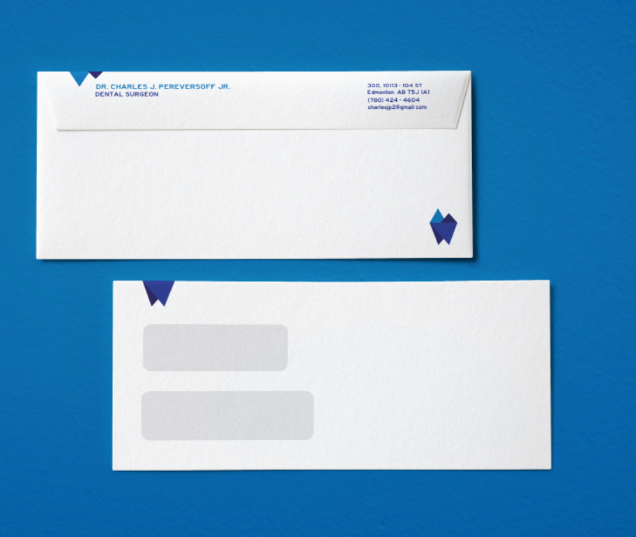
Envelope
The design on the back front of the envelope is limited so that the information about the sender and the recipient is not compromised.
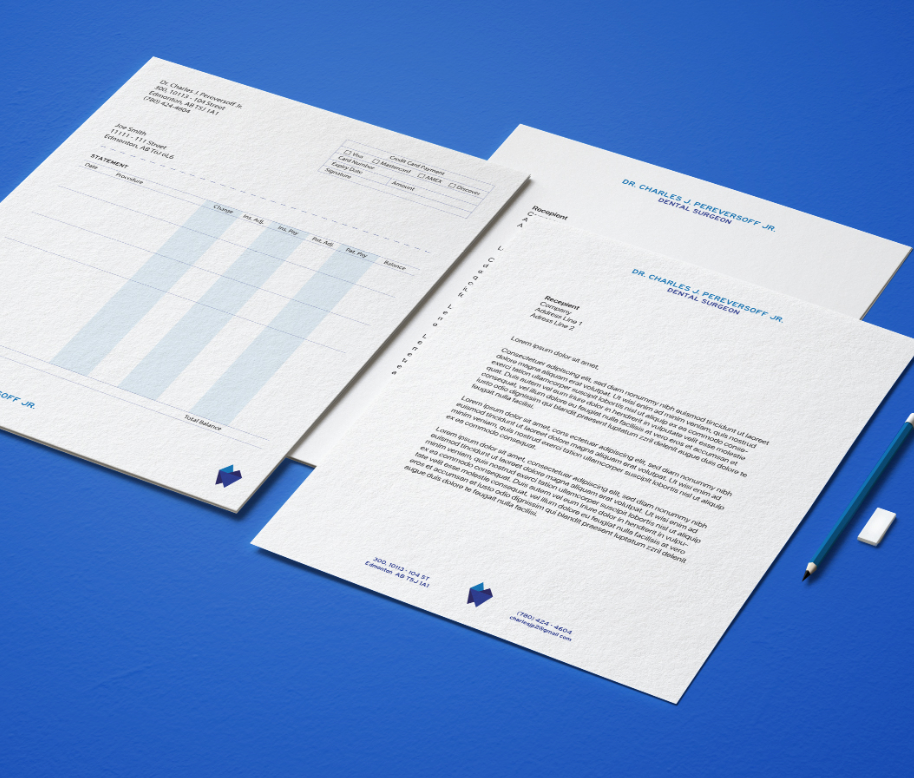
Letterhead and Invoice
The letterhead offers ample whitespace for long body of text. The brand identity is pushed to the top and bottom so that they don’t become distracting.
The invoice layout retained the current layout used by the client. Again, the brand identity elements are minimized a bit so they are not too distracting.
Some process works
SIMPLE + OUTDOORSY—INITIAL LOGO CONCEPT
MASTERFUL + LONG-ESTABLISHED—INITIAL LOGO CONCEPT